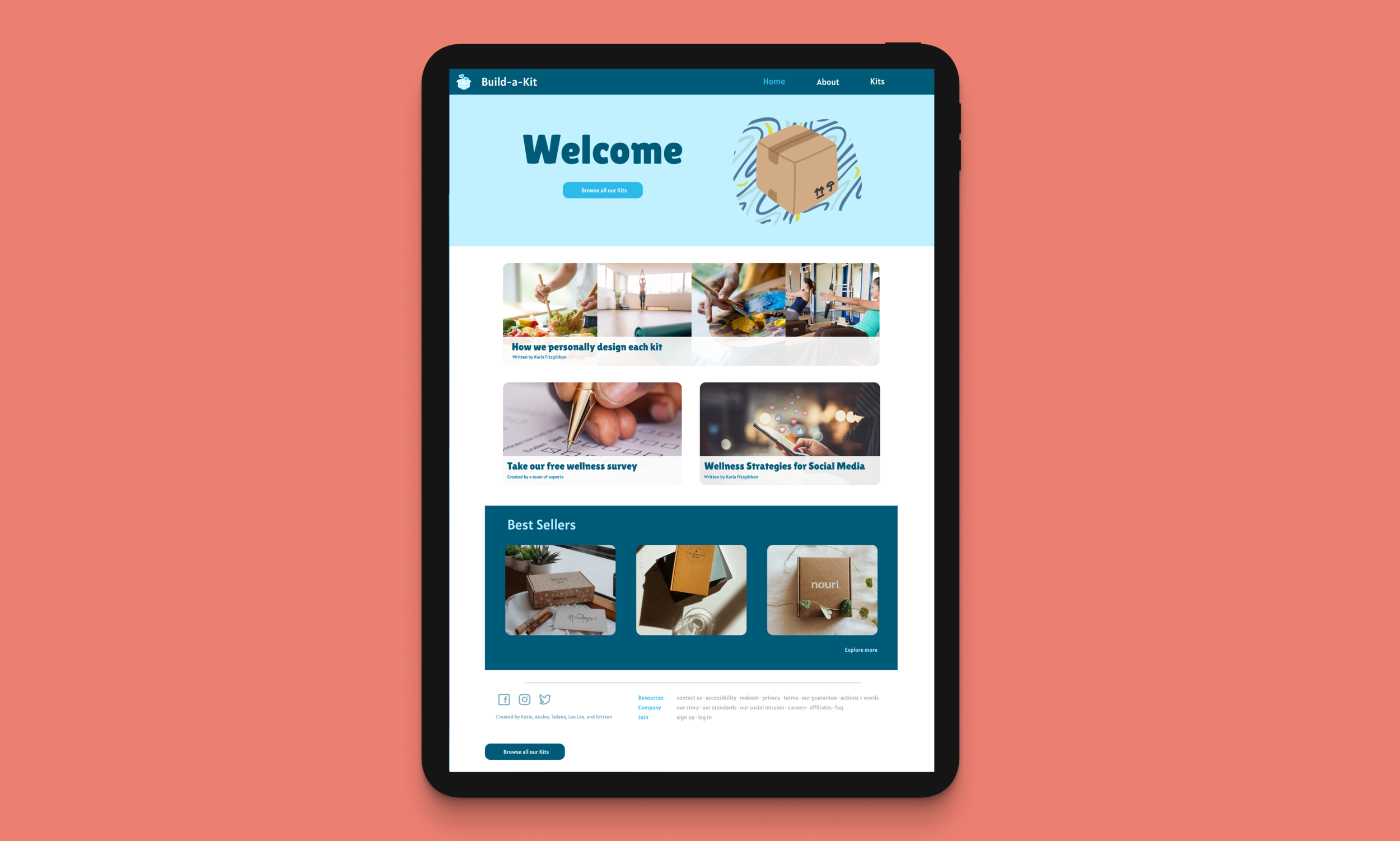
Build-A-Kit
Sed vitae enim egestas, congue arcu et, efficitur augue. Cras sit amet venenatis est. Sed pulvinar sodales lacus sit amet placerat. Nulla facilisi. Integer pellentesque semper magna vel pellentesque. Cras imperdiet tortor sit amet erat aliquet rutrum.
BUILD-A-KIT
A web experience designed to help students explore new methods of self care.
Role: Product Designer Timeline: Jan - May 2021
Team: Designers (4) Tools: Adobe Creative Cloud, Figma, Microsoft Teams
BACKGROUND
College students often suffer from stress. While some students may have a handle on their mental health, other students have no idea what it means to relax and have some peace of mind. There are many useful organizational or stress management apps exist to help us manage our work loads, but it gives people one more excuse to be on their phone. Our challenge will be to meet the needs of students with varied methods of self-care through technology or service.
SOLUTION
Build-A-Kit is a mindfulness service that allows students to take a survey on their phone and receive a weekly package with a certain focus. Some packages might play to their interests and might encourage resilience habits they already enjoy. Other packages might introduce them to something new and give them all the information and resources they would need to try it out.
CHALLENGE
Creating a service for individuals who all have incredibly varied and personal approaches to self-care
Having our service reflect a process of discovering unique modes of self-care
Narrowing down our problem scope
RESEARCH
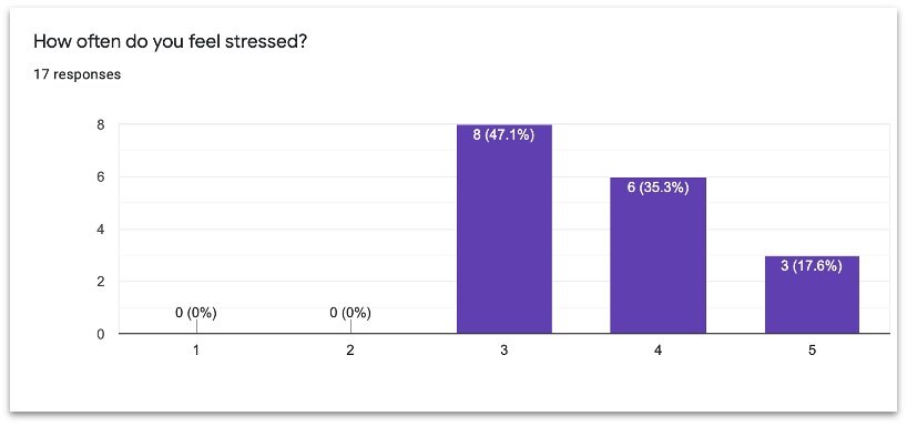
Surveying Georgia Tech Students
We wanted to collect data and conduct interviews with current Georgia Tech students in order to better understand the audience we were designing for and helping. However, we were aware that not every student had the same experiences or interests in design, and different learning challenges may occur for different students.
Thus, we conducted semi-structured interviews and collected numerical data on a Google Form survey. From there we learned that:
People deal with stress through a variety of means
There was no consensus in our research
Individuals all have incredibly varied and personal approaches to self-care, and we want our service to reflect a process of discovering unique modes of self-care
and general activities students do to relieve stress include:
Physical activities
Meditation
Spending time with friends
Watching shows
Reading
Listening to music
Socializing
Understanding the User…
We want our service to appeal to the range of Georgia Tech Students that are experiencing high-stress would be able to receive a package:
Local and International
Off-campus and on-campus
Male, Female, and Other
All socioeconomic status
Atheist and Spiritual
Queer and Straight
Stressed out, high anxiety
PERSONAS & SCENARIOS

Key Insights from Storyboards
Based on our finds, we learned that some packages might not work for people, and while they might be okay with receiving a surprise package, everyone’s response to a mindfulness practice will be different.
Our survey at the beginning should be as thorough as possible
Using a mail service means there will be a delay, do we offer other activities for the user while they wait?
Some people will have pre-exposure to mindfulness activities, and know what they are looking for
Maybe we ask people in the survey if they only want to receive packages they select, or if they want our service to recommend a package and send it to them
Users will be using our packages the most when they are stressed and in a bad mood
We should make the fonts and colors soothing, or pleasant to look at
In Eric’s example, however, we don’t want a package to come across as ‘girly’ or ‘manly’ because both men and women might sign up for the service, and they may not want to feel like they will be judged for receiving a package that appears gender-specific
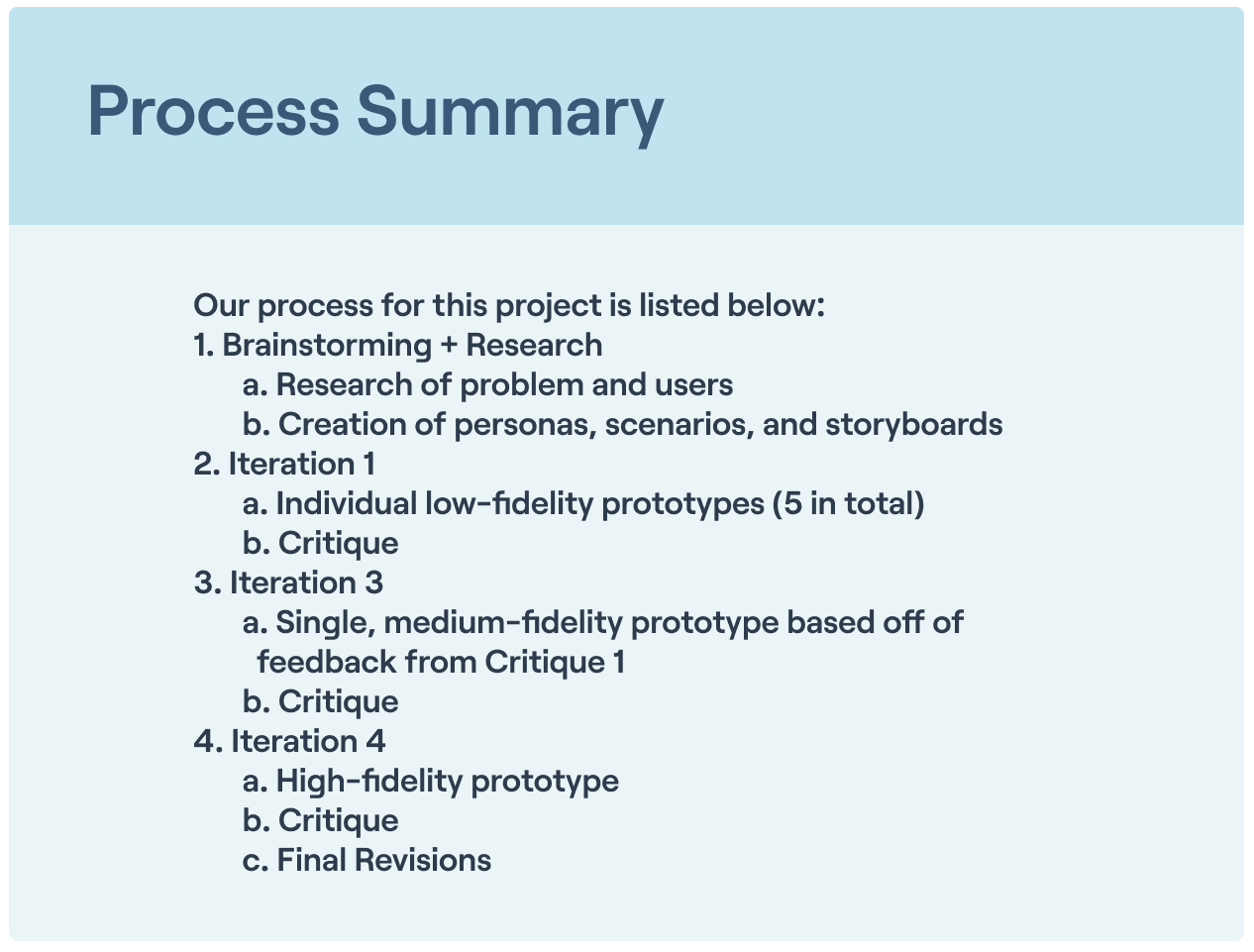
Low-Fidelity Prototypes
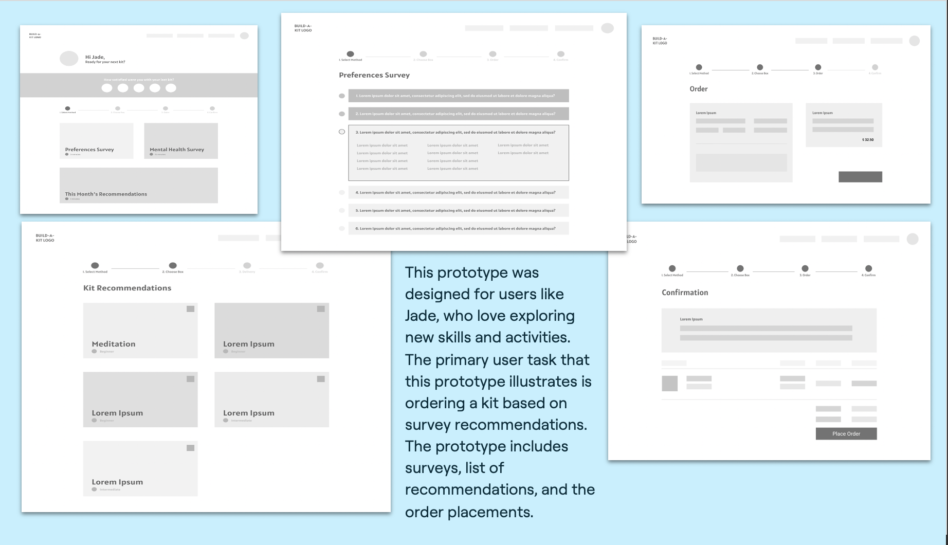
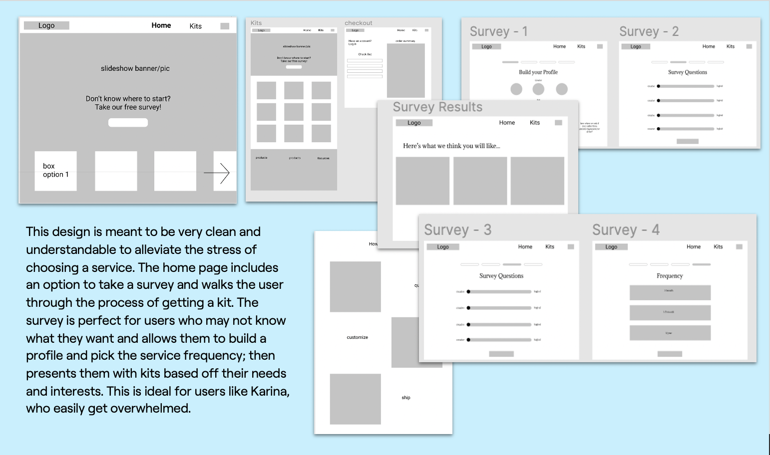
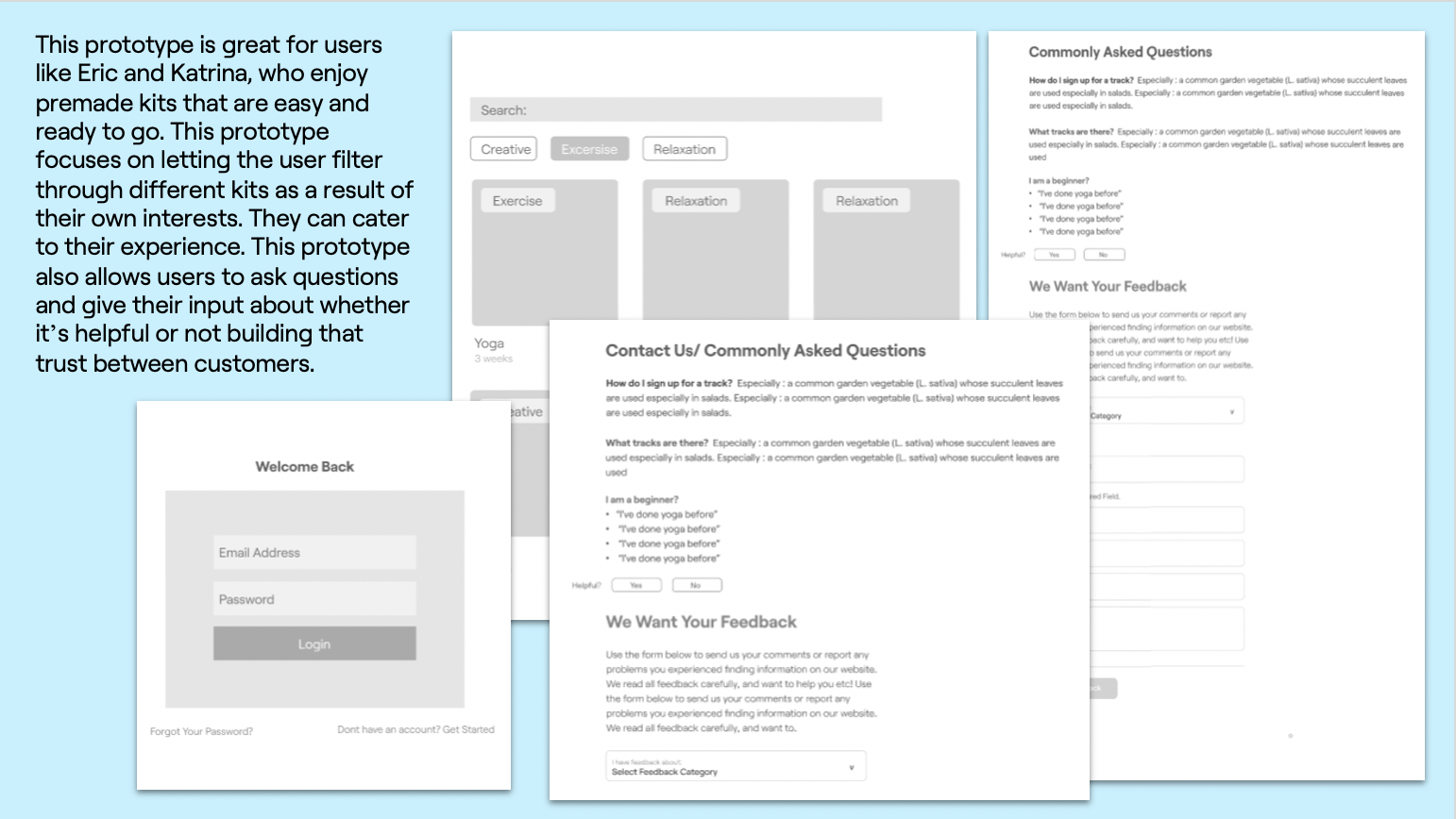
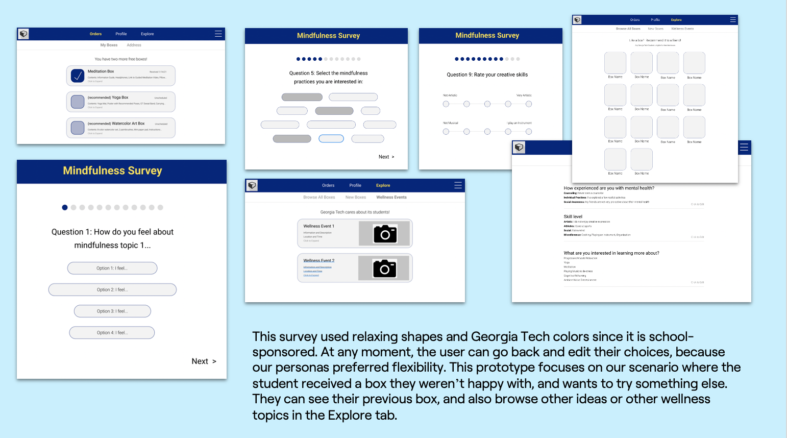
Using the research as a guide, we explored different solutions through low-fidelity prototypes.
PROTOTYPE 1
PROTOTYPE 2
PROTOTYPE 3
PROTOTYPE 4
PROTOTYPE 5
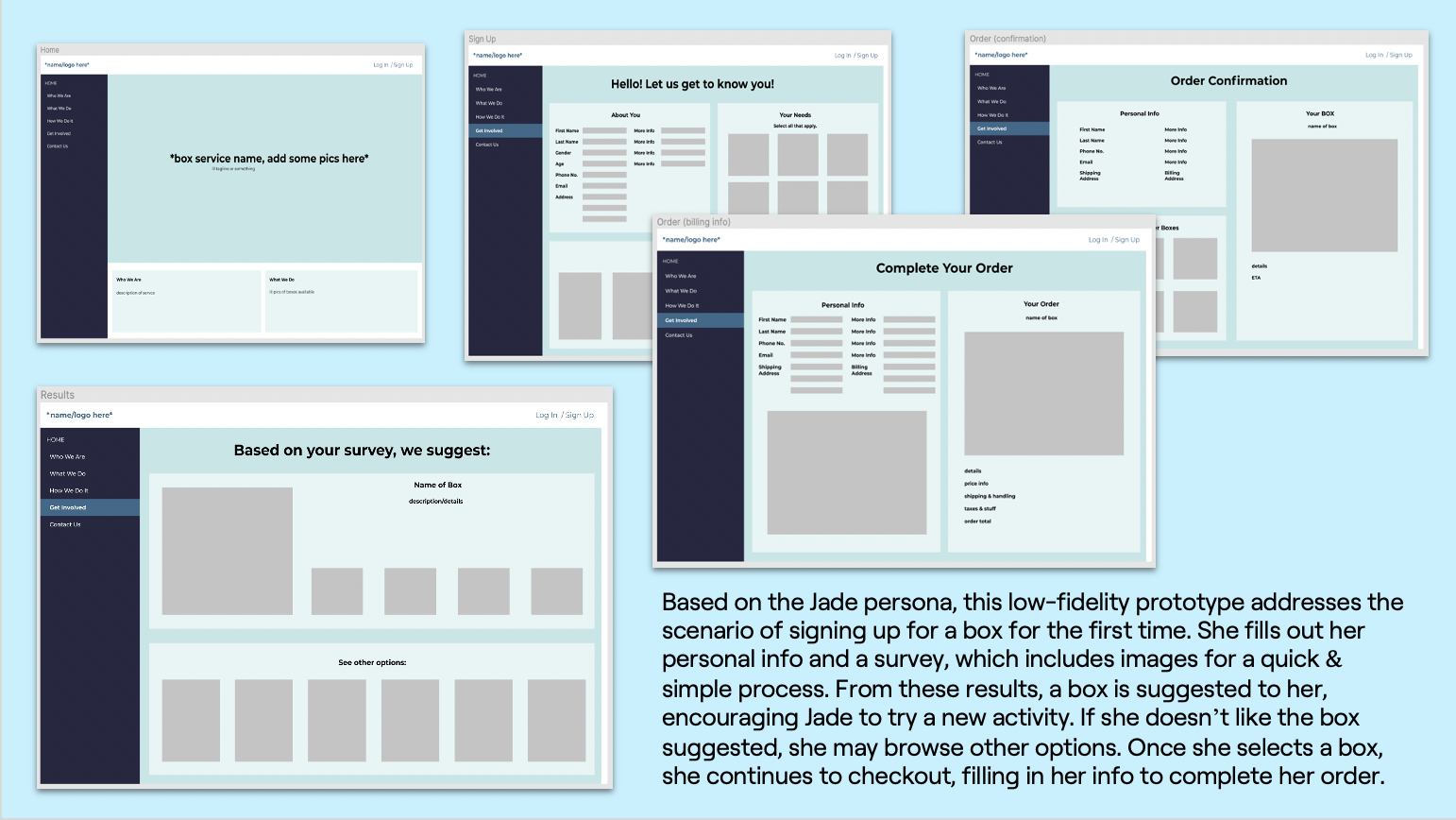
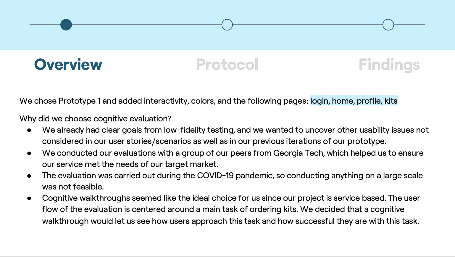
Heuristic Evaluation and Design Iterations
Final Product: High-Fidelity Prototype
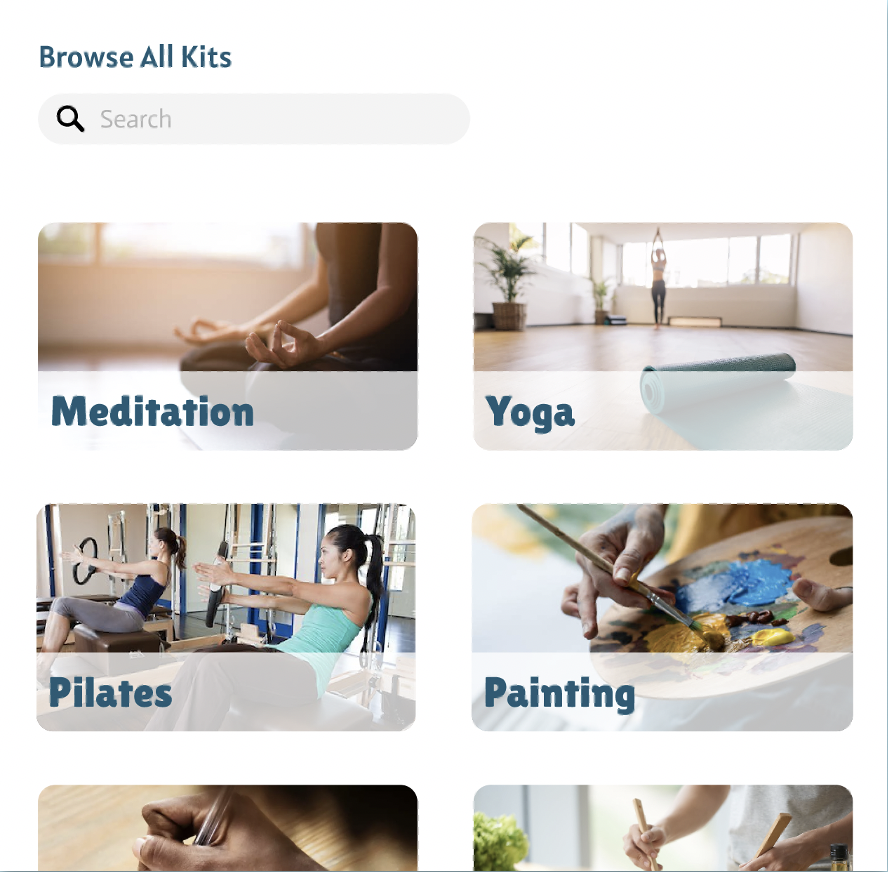
FEATURE 1: BROWSING KITS
Where to Start
When the user first uses opens the kit, they are able to use the browsing option and search for kits out of the many options to choose from.
This allows for personalization and for the user to find choices that cater to their needs
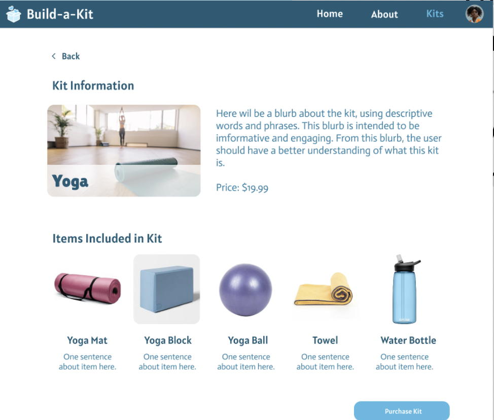
By clicking on a kit, the user is granted a more in-depth description of it as well as the featured items included in the kit.
Feature 2: WELLNESS SURVEY
One of our unique features
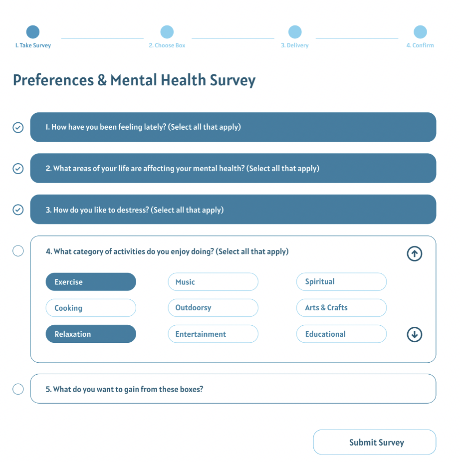
Users can take a survey that asks about their overall wellness
Users’ responses will generate a list of recommended kits that they can learn more about or purchase
Taking the survey is not necessary for buying a kit, but it is essential for our personas that do not have a lot of experience with wellness activities and do not know where to begin

FEATURE 3: ORDERING A KIT
After selecting a kit
Users enter their delivery and billing details
Users review shopping cart and order details
Users will get a confirmation screen after ordering

FEATURE 4: HOME & ABOUT PAGE
Standard Features
Home Screen
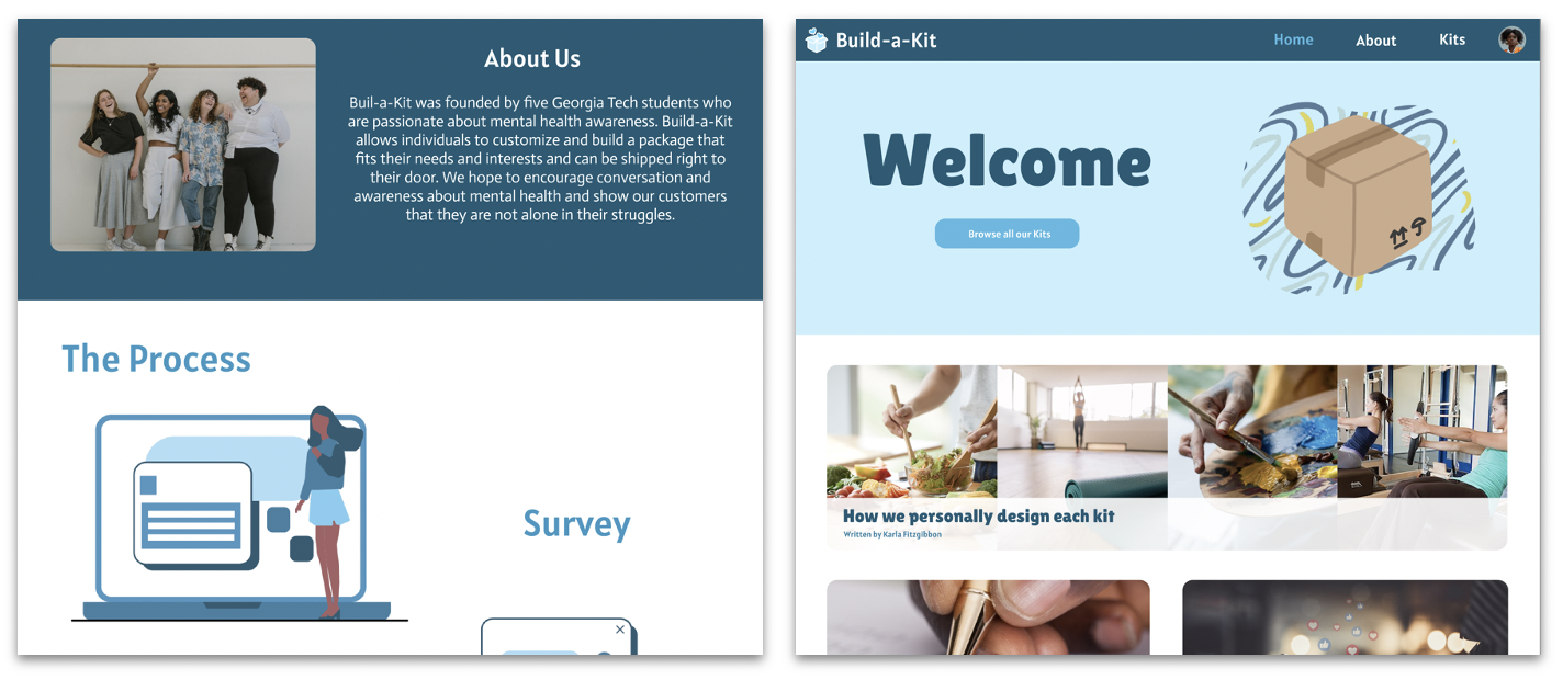
Includes our main features: browsing kits and wellness survey
Additional content that considers the users’ wellbeing, such as wellness articles
About Screen
Includes our founding story and an explanation of our product which builds trust and comfort
FEATURE 5: PROFILE & LOGIN
About Me
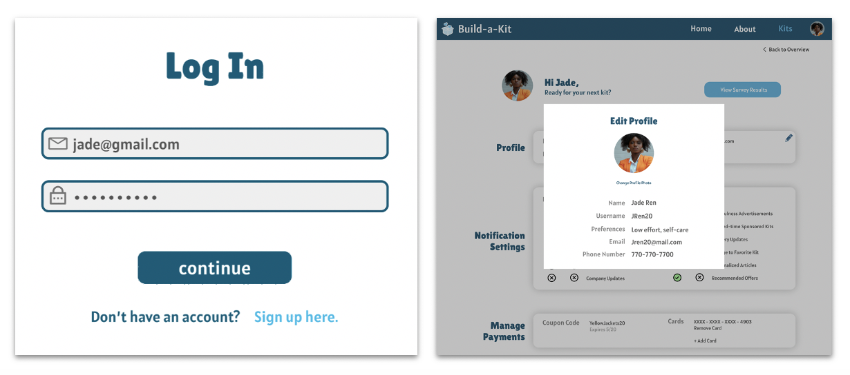
Users can edit their profile allowing the kit to be personalized to their needs. This includes adding information like their name, username, email, and phone number as well as preference.
The profile page also shows a list of the kits they have purchased, an brief, one-question review of the last kit they received, and a link to the survey results
A login feature is also featured granting security to the app.
Link to Figma File of Prototype: Prototype
Link to Interactive Prototype: Interactive Prototype
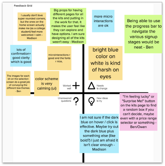
Insights from High-Fidelity Prototype Critique
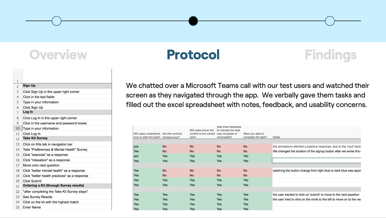
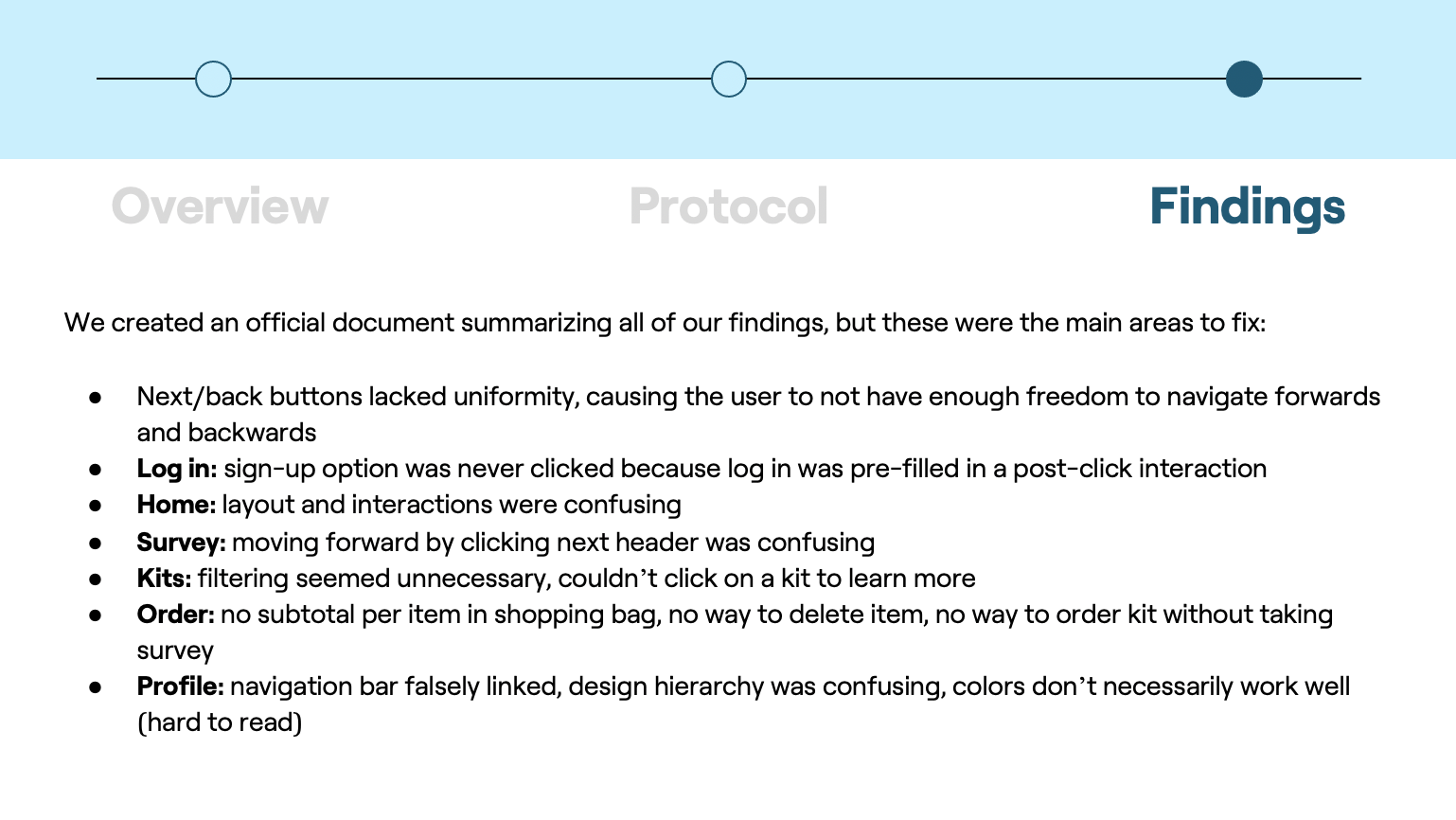
From our Cognitive Walkthrough results, we made the following changes for our high-fidelity prototype:
Added consistent next/back buttons
Log in: removed the pre-filled information and prompt users to sign up if necessary
Home: added interactions to every section on the page
Survey: added next buttons & color coding
Kits: took away filtering options, able to click on a kit to learn more about it
Order: added a subtotal per item in shopping bag, able to delete items from the bag, able to order kits from all kits page now
Profile: corrected navigation links, edited the design hierarchy to provide better clarity, refined color scheme
Overall, these changes made our high-fidelity prototype clearer and more accessible. All results from the cognitive walkthroughs were addressed, and changes were made accordingly in order to provide a more refined and effective product.
Final Reflections:
REFLECTIONS ON OVERALL DESIGN PROCESS
We learned how important it was to tie our research into every step of the design process
We learned about the value of user testing which can reveal flaws in our design
We learned how to work together as a team to create a complete product based on user research
Areas for Improvement
Creating the prototype at the same time as the cognitive evaluation did not work, because we did not know how to write out each step
We didn’t spend any time creating a style guide or thinking about the color scheme or shape choices, so there is no reason for any of the decisions we made in that sense
Creating the Figma seemed disorganized, we did not fully utilize components which led to extra time spent on it, and we did not know what screens we wanted to make when we began working on it
Challenges Faced
Coming up with an interactive experience for resilience and self care that could be carried out on a fully virtual platform
Overcome by brainstorming individually and as a team to think of a service that filled this need
Finding times to meet virtually as a team
Overcome by taking a poll of what days/times worked for team members’ schedules and selecting the meeting time best for everyone
The initial misunderstandings we had of the rubrics
Overcome by discussing the assignment with Sara to clarify our initial misinterpretations
Lack of familiarity with Figma for some team members
Overcome by these team members adding more content to screens while team members with more knowledge of Figma added interactions/animations
Emphasizing the Survey portion of our service in the prototype without making this a requirement
Overcome by incorporating the Survey into various screens but allowing the option of browsing and buying kits without completing it
Next Steps
If I had more time during this project I would:
Expand our kit options beyond the 8 we have right now
Given more time and iterations, we could expand our kits to include other popular hobbies such as listening to music, knitting, etc.
Provide a customizable subscription option where they can choose how often they want a box sent
This addition could make it easier for users who get easily stressed
Include a “surprise me” button for users who do not know what they want